The tickets for Russell Davies‘ interesting2008 conference went on sale today 9am GMT. This should be an interesting thing again. But not for me. Tickets were sold out in less than 3 hours, when I got around to log in from work. Sigh.
by Jonathan
The tickets for Russell Davies‘ interesting2008 conference went on sale today 9am GMT. This should be an interesting thing again. But not for me. Tickets were sold out in less than 3 hours, when I got around to log in from work. Sigh.
by Jonathan
The Watchman-Movie is already in postproduction and now director Zack Snyder has announced an advertising contest on the Watchmen Youtube channel. Fans are invited to create and submit commercials to be shown on TV screens in the background of the movie.
The idea to give fans out there the opportunity to create a real part of the movie is genius. It genuinely challenges fans. Much more than, say, „Send us your craziest picture of you using product XYZ!“. And, nice side effect, it also creates buzz without showing too much of the movie. I wonder what the commercials will look like.
Btw, here is a screenshot of another movie I expect with rising enthusiam: Spike Jonze’s „Where the wild things are“ („Wo die Wilden Kerle hausen“).

And now excuse me, I am off to do some market research and insight hunting for Veidt products in my copy of Watchmen.
Edit: Crap. Martin has pointed out the entry rules to me, who limit the contest to U.S. residents only. I’d understand that if it was a domestic U.S. brand, but this is a movie for global release. Well done, legal department. You have just locked out two thirds of the Internet, because the risk to pay flight tickets for a guy from Abkhazia was too high.
by Jonathan
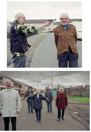
Last week I stumbled across these weird images:
Do you recognize them?

After some scratching my head, I summoned the power of the internet and a simple „where do these images come from?“ brought the answer within minutes: They were made by Glaswegian art group Henry VIII’s Wives. And yes, they are aged citizens in their neighbourhood reenacting „Iconic Moments of the Twentieth Century“ See how many you can recognize.
They also reminded me of Jon Haddock’s reinterpretation of iconic moments in the real world and movies that I saw a couple of years ago, where Haddock drew them in the isometric view of computer games like Civilization or The Sims. Same moments as above:


He did a lot more. They are all worth a closer look, click here. (most of Jon Haddock’s work is worth the look)
I am generally fascinated by those reinterpretations. They demonstrate how original images truly deserve the term iconic. I mean, they were shot long before I was born. Nonetheless, we immediately recognize them again, no matter how sketchy the reenactment.
by Jonathan
by Jonathan
This was good. I have not seen a planning process in a team like this in action. I had exchanged mails with George prior to the workshop and he had mentioned that this was rather about „strategy being about ideas that are stimulated and confirmed by research rather than strategy being something that emerges from research“. I get what he meant with stimulation.
It really was about laying out as many potential routes as possible before deciding where to go. Getting ideas for brand values, ideas for consumer values, ideas for consumer insights, ideas for propositions and spot the route through that multitude that hums best. The hardest part about the process is probably turning off your filter that keeps trying to cut away things.
I believe this can be exciting with smaller clients and companies to produce a useful platform for communication in a day or two. It takes an experienced planner to facilitate the process, keep it running and spot the nuggets. And trigger lateral thinking.
Another nice aspect of the seminar was meeting some of the few Account Planners in Austria. I can now safely assume that there are no more than 20 people that have Account Planner or Strategic Planner as their job title. And all sit in the network agencies lik TBWA, DraftFCB, Ogilvy, BBDO et.al. or work as independent consultants.
The bad news of this: the job situation is pretty dim. The good news: there is potential for Account Planning here and especially for the agencies who embrace it.
by Jonathan
First day of the Account Planning Tools Workshop with George Shepherd in Vienna. The few times an opportunity for training comes up in Austria, I have to be there. Even if I pay the whole thing myself.
George, who worked with Y&R, the Leigh Agency and Red Spider, is introducing us to his Account Planning Toolkit, a blueprint and set of templates for a planning process. A lot of hands on work in groups, with a lot of brainstorming and thinking. With his templates I found you can move the results to promising routes without limiting the broadness of ideas. So far, I find this especially useful for teams that have to bring up results in a very short time.
I assume that whole thing works a whole lot better in the real world compared to five advertising people in a hotel lounge, when the client is involved and the agency has done the homework.
The LeMeridien is pretty chic, the room with the name „Eternal Black“ not as dark as it’s name. Just the typical hotel conference room. No photos, yet. Hopefully, I will get around to post some tomorrow.
by Jonathan
 I am still working myself through the comic book canon. Along the usual suspects like Moore, Miller, Ellis, Ross, Otomo, Sartrapi or Thompson every now and then I find (in this case by a friend’s recommendation) something new and amazing.
Shaun Tan’s The Arrival is one of the best graphic novels I read so far. Without any words Tan tells the story of a man moving to a foreign country to build up a new existence. He illustrates with dreamlike images the overwhelming experience to arrive in a country where everything is new, larger and no sign or writing makes sense. Shaun Tan incorporates stories of refugees, questions like ‚What makes a home?‘, friendship, loneliness to a beautiful story. All captured in simple, yet powerful pencil art.
Fantastic. Highly recommended. If you plan to grab just one comic book or graphic novel this year, make it this one.
by Jonathan
Been a bit quiet the last weeks on the blog. That is because there have been major operations underneath the hood of this blog (update to WP 2.5, CSS-Sprites, several plugin-thingies like caching and customizing content), linking to a lot of services that will do great for connecting to the outside world and of course, my shiny new 100% personal and unique (it’s all my handwriting!) WordPress theme: Jonispace.
Sometimes I come to believe that I am not that bad with CSS and webdesign. There is still room for improvement, but for now this looks good.
On with the content!
by Jonathan
I still can’t tell whether this is a good or a bad thing.
So I want to search for account planners in Austria, maybe find agencies that have planners and planning departments. What to do? Start up the Google engine and type in „account planning österreich“ and here is the result in unretouched screenshot glory:
And ranked at five: me. The link actually goes to a report I wrote for university about my exchange year at the University of Oklahoma (where I had my first real exposure to account planning).
So the first Google results for „Account Planning“ bring up an Account Planning Workshop in April (for which I have signed up already) and then me, some guy who tries to keep in touch with Account Planning in his free time. What does this say about the state of Planning in Austria?
I mean, face it, the largest non-network agency Demner, Merlicek & Bergmann calls Red Spider for planning duties when clients request it. And the general quality of advertising … oh well, let’s not get into this.
But there is a handful of planners in Austria. FCB, TBWA and other network agencies have planners. One sent in a reply to Heather LeFevre’s Account Planner Survey 2007, there is one Austrian in the Plannersphere (but he works in Hungary), none found at LinkedIn, one at Xing (German equivalent to LinkedIn). I haven’t checked StudiVZ yet, but it can’t get much better.
* The search results are bound to change: I will add some posts about planning things I did in the last half year or so in order to fortify my spot at the forefront of Austrian Planning.
by Jonathan
This week started with a pleasant surprise:
Rob Campbell posted Paul Colman’s reviews on the presentations for the assignment on Extra gum. After short disappointment because I wasn’t able to identify my presentation from the feedback (see whole story here) it turns out the winning presentation is my entry.
To sum this up in short: Extra is the everything else gum of Wrigley’s. The brand is spread out to appeal to everybody, and also the vehicle for new products. My recommendation was to define Extra by leaving innovation to a new brand, and putting focus on Extra as functional gum that aids concentration, focus etc.
Personally, I knew that this would taken two more slides, but ten was the limit. I REALLY would love to see Assignment „I“: „Mental Hygiene“ is perfect, sums up my positioning thoughts much better. In fact, I would love to see all the other presentations. It was always great to see where all the other minds went.
BIG Thanks to Paul and Rob for taking the time to a look at the work.
But, alas, back to work. The new assignment is up already online.
Hm, I can’t help it, but I still have a suspicion that there has been an error and Paul Colman will ask me to return my price.
